Discord Growth
Since 2020, I’ve been leading design for Growth at Discord with goal of making the product easier to use for our next 100+ million users.

In early 2020, we repositioned Discord to be more friendly to communities besides gaming. This meant a renewed focused on improving our registration flow, onboarding, and helping users create successful communities.
Discovery and Definition
Using a mix of qualitative data and user feedback, in 2020 we identified a handfull of issues with Discord’s registration and onboarding.
These problems were:
- We didn’t educate users about our core primitives (servers, channels, etc).
- The path after registeration was confusing and often led to states where the user had little idea of what to do next.
- Finding your friends on the app was difficult.
I’d be remissed if I didn’t mention the amazingly talented designers that I now work with on this team. San Chung, Selina Her, and Brett Johnson all now produce the designs on our team. This case study will focus on the projects I primarily designed or co-designed as we built the team to what it is today.

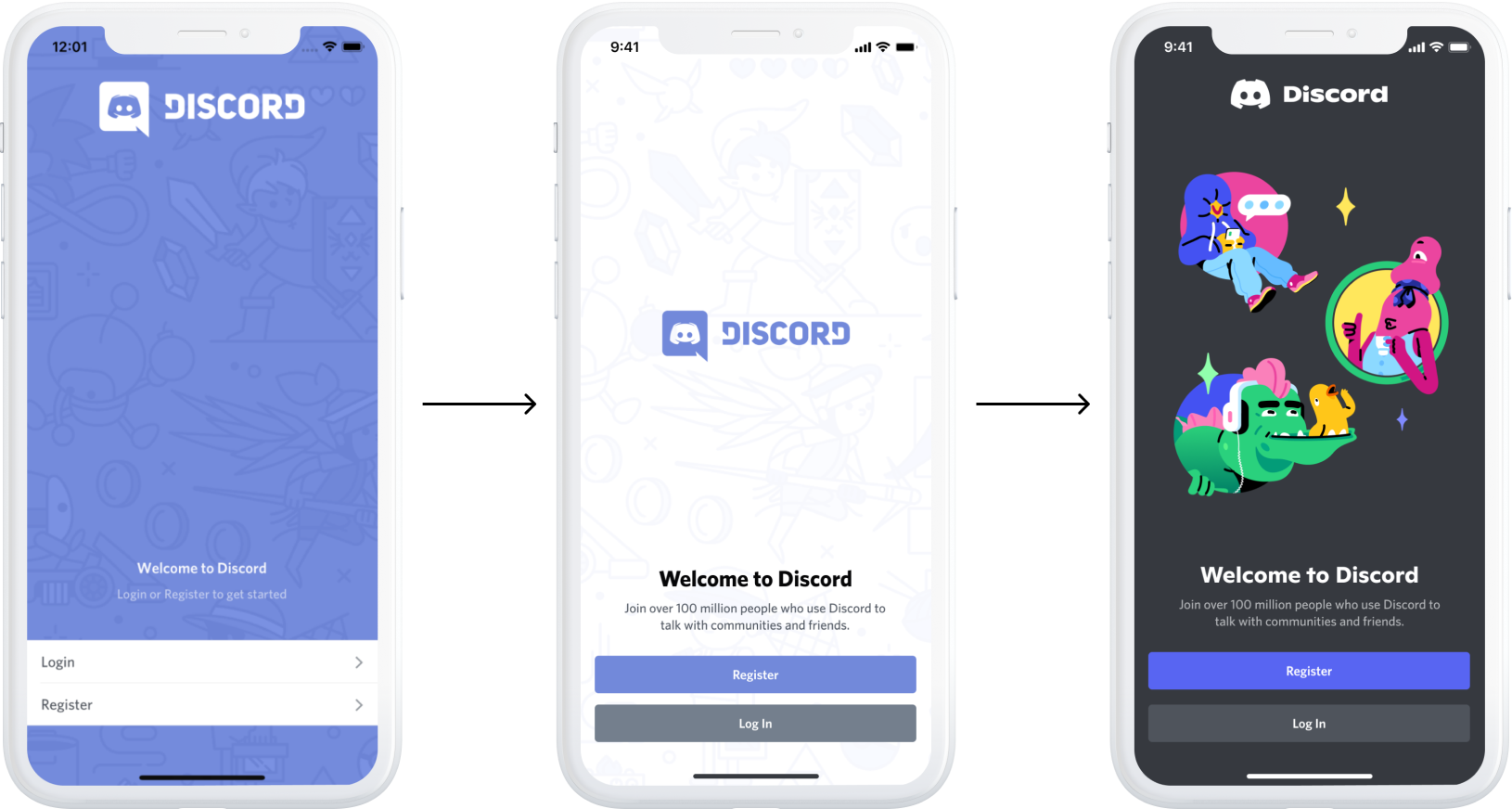
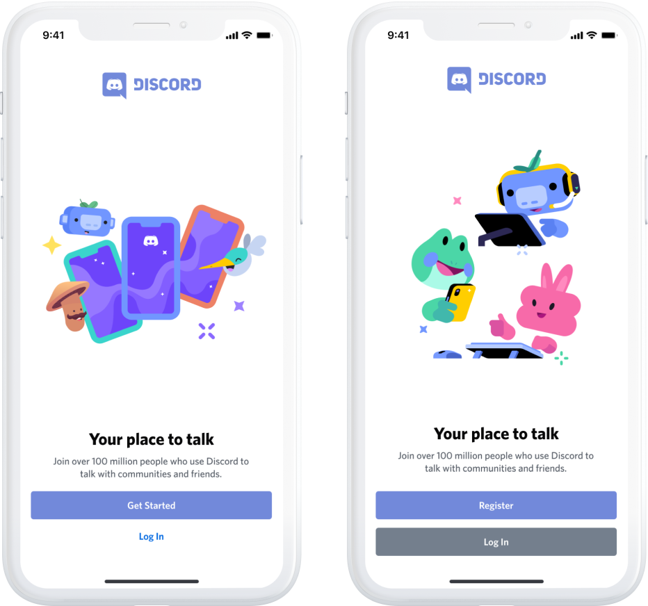
Establishing a new visual baseline
User testing taught us that our current buttons and inputs didn’t seem interactable. Our app’s splash page didn’t tell users anything about the product, and steps of registration looked inconsistent from being updated piece by piece.
I started design by updating the visual design of the steps we knew we needed for registration and login. That way we could build from a baseline we knew was working and our future iterations would be consistent.

Onboarding help
During user testing we heard common phrases like “What is a channel?”, “Are voice channels like a phone call?”. Channels are how users organize their server by topic, so a new user not understanding one of the core primitives of the product was a big contributor to why they felt confused.
Our solution was to improve the empty states of the most commonly visited parts of the app along with tutorial messages to introduce these concepts.
We tested this approach with interactive prototypes and users first. After seeing success with our user tests we released this project as an experiment and shortly after to production in early 2020.

Server templates
San Chung and I co-designed this project into production across Desktop, Android, and iOS. Discord Servers are hard to understand for new users. They’re a primitive that can be used for communities of 800k people, an private book club for 10 of your fellow hobbyists, or for a classroom of 100.
By providing a list of templates to build from, we could teach users what Discord could be used for and guide them through the process resulting in a less confusing user experience.
Server templates were designed around our most common uses cases “a place for friends”, “study group”, “an art community”. This screen did double duty of education about the product and helping them onboard.


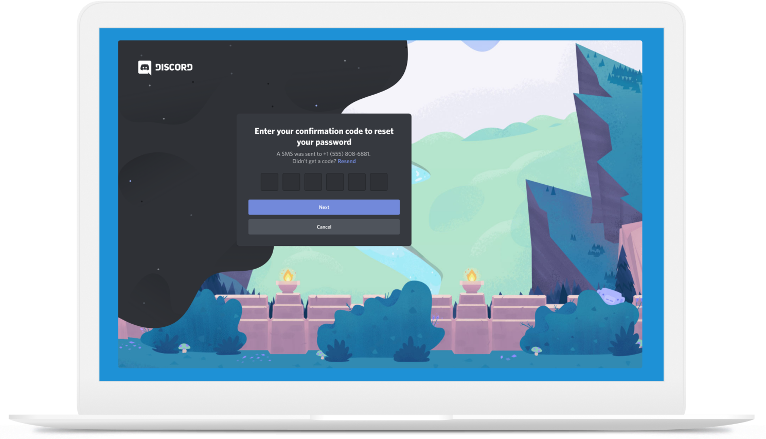
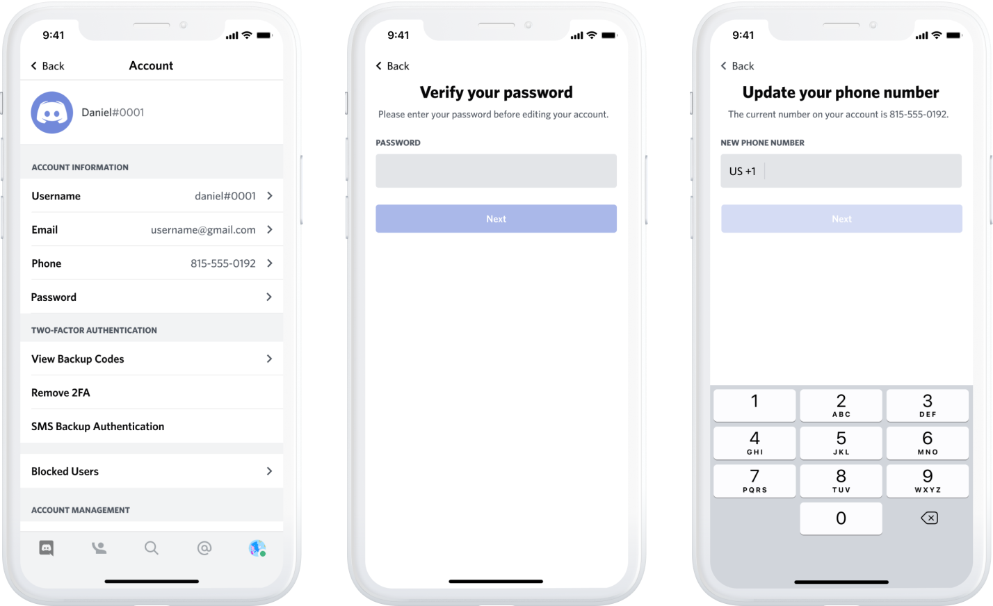
Phone Registration
Next we built phone registration to make signing up for Discord easier. This feature had two benefits, less friction to register and it allowed us to work on social graph features as our next project.
This project spanned across all three platforms we support(Desktop, Android and iOS). Phone registration is a good example of a project that seems simple in practice, but requires a considerable amount of design for all of it’s various states (update, remove, add phone number etc).

Finding your friends
To make finding people you know on Discord easier, we built “Find Your Friends” which let users upload their contacts to find existing Discord users.
One of the challenge of this project was staying privacy focused. We let users decide whether or not other people could find them. We had to balance this messaging and make it simple to dig further into your privacy preferences. We used user research to help us message this feature since it’s uncommon with other modern social media networks.
Another problem we had to solve was how to surface this feature for new users vs existing users. We decided to promote the feature before launch to help educated our existing users on how it would work.Selina Her, the designer I mentioned earlier worked side by side on this feature. She owned how it would fit within Discord's onboarding while I had started on how the feature a few months prior for existing users.


Measuring and validating designs
All of these features were tested with various experiments. On our growth team, forming a hypothesis, testing variations of a design, and measuring it’s impact are critical to learning.
Quantitative feedback was used for us to measure the true impact and success of these projects during experimentation and post launch.
The Result
All of these features, except for designs showing variations we tested, shipped in 2020 or early 2021.
To date, the Discord growth team has shipped dozens of features, tested even more ideas using experimentation, and is continuing to work on improving our product for our next 100+ million users.
While there's still a considerable amount of work left to be done, I'm proud of the work my team and I did for the features showcased above.

